Bottom Formation 1.4 - Technical Analysis
Disclaimer: This is not financial advice. Anything stated in this article is for informational purposes only, and should not be relied upon as a basis for investment decisions. Chris Keshian may maintain positions in any of the assets or projects discussed on this website.
To subscribe to my mailing list, input your email here.
To determine when to begin spot positioning in crypto assets, I look for bottom formation by watching signals from four key areas: Macro, Capital Inflows, Sentiment, and Technical Analysis. I arrived at these areas by regressing the change in price against a number of independent variables - a process I outlined in an earlier post titled Models . While each of these taken in isolation can be misleading, the confluence of all four help me identify an approximate high time frame accumulation range, and therefore an appropriate time to begin spot positioning between market cycles.
The previous posts in this series are:
Bottom Formation 1.0 - Intro
Bottom Formation 1.1 - Macro
Bottom Formation 1.2 - Capital Inflows
Bottom Formation 1.3 - Sentiment Analysis
Bottom Formation 1.4 - Technical Analysis
While I do think we are currently in the midst of a bear market rally, I believe we are in the early stages of this bottoming process. As such, I plan to track these signals more closely over the coming six months, and add to my spot positions as more of my conditions are met.
In this post, I will discuss the Technical Analysis signals I track, reproduced below:
HTF Wyckoff Accumulation Pattern
21-week Moving Average
Interaction Between HTF Exponential Moving Averages
Total 2 Market Cap Retracement
Stock RSI Cycling to the Lows on the HTF
MACD Cross
HTF Bullish Divergences Present on both AO and RSI
BTC Log Chart Cycling to the Low of the Range
Price Above the HTF Ichimoku Cloud
Backwardation After a Horrific Down Candle
HTF Wyckoff Accumulation Pattern
The Wyckoff Accumulation Schematic was developed by Richard Wyckoff, an early pioneer of technical analysis. According to Wyckoff, the market can be understood and anticipated through detailed analysis of supply and demand, which can be ascertained from studying price action, volume, and time. An idealized schematic for how he conceptualized bull and bear markets is shown below.

The below chart shows the approximate accumulation pattern that Wyckoff has identified. This pattern has emerged time and time again in different asset classes, and can serve as a reference point when building a long term spot position in BTC. I am watching for a HTF accumulation pattern that loosely resembles this structure.

21-week Moving Average
The moving average (MA) is a simple technical analysis tool that smooths out price data by creating a constantly updated average price. The average is taken over a specific period of time (e.g. 10 days, 200 days, etc.). For BTC, I prefer to use the 21-week moving average. As shown in the image below, I am watching for this 21-week MA to flatten out for a period of time in order to feel comfortable spot positioning. This flattened MA is shown in the previous bear market, highlighted in the red box.

Interaction Between HTF Exponential Moving Averages
The below chart shows the 12-week EMA (exponential moving average) in red, and the 21-week EMA in blue. You can read more about exponential moving averages here. As shown below, when we are in a bull market the 12-week EMA is above the 21-week EMA, because momentum is to the upside - since more recent prices average higher than longer trailing prices.
When charting these moving averages on the weekly time frame, I look for a compression of these EMAs. As you can see in the below image of the 2018 accumulation range, the EMAs compressed, and ultimately, the 12-week EMA broke above the 21-week EMA, which precipitated the next bull cycle.

As shown in the below chart, we are in the first phase of compression for these EMAs, so I think we are still in the early phases of this bear market consolidation period.

Total 2 Market Cap Retrace to -80% Range
Total 2 is an index that tracks the entire crypto industry, but removes bitcoin. Historically, we have seen retracements during bear markets in the -90%+ range.

I am watching for Total 2 to retrace at least -80% this bear market, as I think valuations across many publicly traded crypto assets are still too high. This -80% retrace aligns with a full retracement back to the 2021 yearly open, which would signal a reset in valuations to the more reasonable levels before the massive monetary expansionary period we saw throughout 2021. Currently, as shown below, Total 2 has only retreaced to ~-75%.

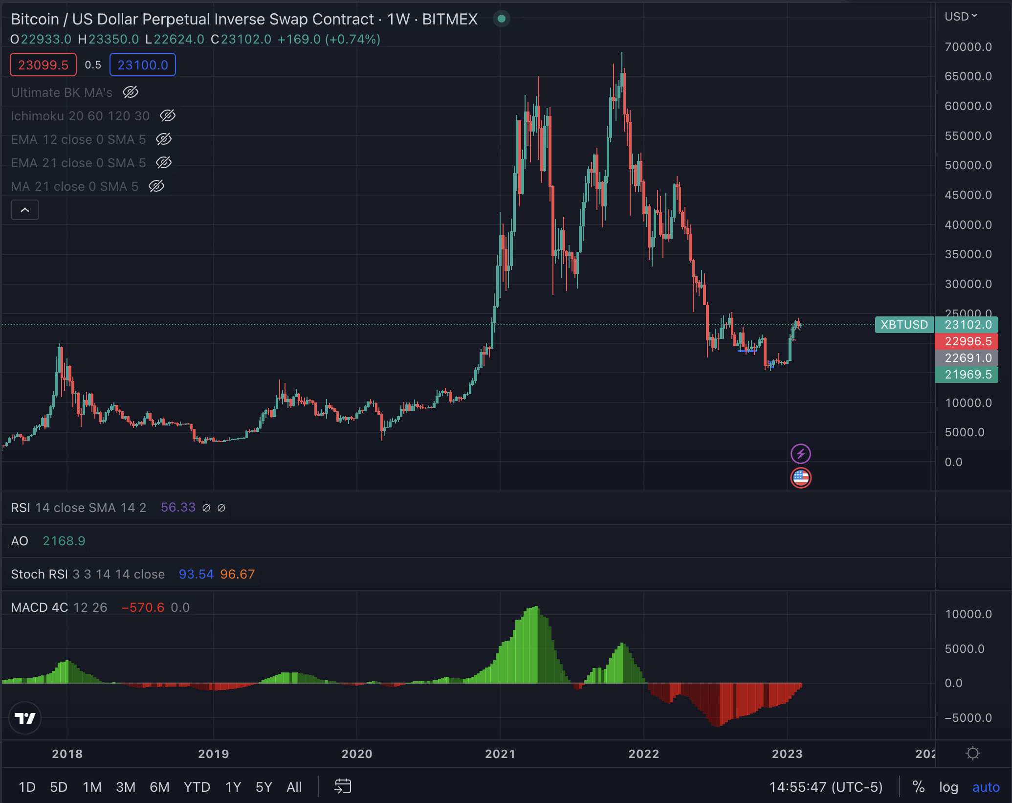
Stock RSI Cycling to the Lows on the HTF
The Stochastic RSI (StochRSI) is an indicator used in technical analysis that ranges between zero and one (or zero and 100 on some charting platforms) and is created by applying the Stochastic oscillator formula to a set of relative strength index (RSI) values rather than to standard price data. Using RSI values within the Stochastic formula gives traders an idea of whether the current RSI value is overbought or oversold.
The Stoch RSI oscillator was developed to take advantage of both momentum indicators in order to create a more sensitive indicator that is attuned to a specific security's historical performance rather than a generalized analysis of price change.
I track the BTC Stoch RSI on the BTC daily and weekly charts and look to position once the Stoch RSI has cycled back to the lows. As you can see from the chart below, the Stoch RSI is currently at the highs, given the rally we have seen early this year. As such, I plan to wait to add to my spot positions.

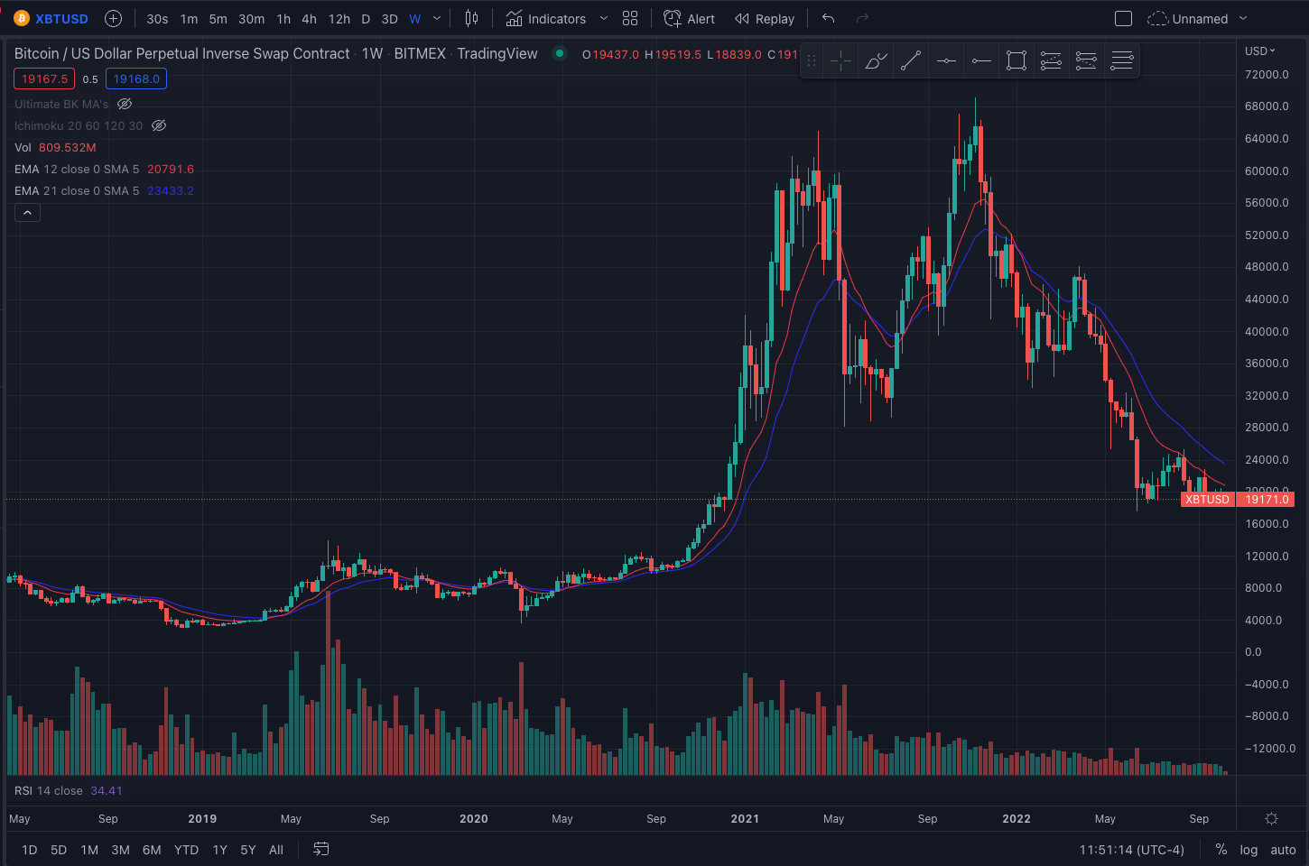
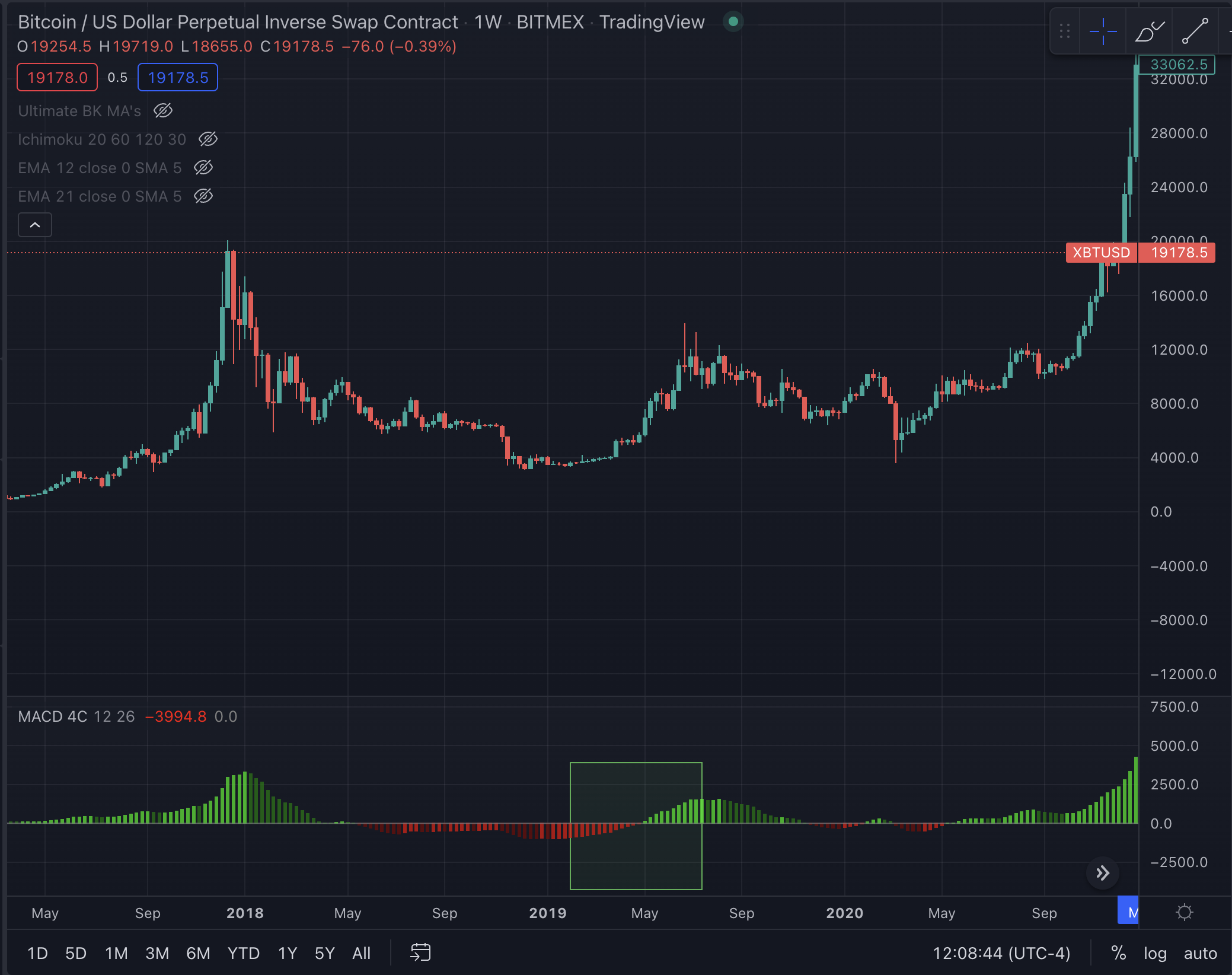
MACD Cross
Another indicator I watch is a crossover from negative to positive on the MACD. The MACD is a trend-following momentum indicator that gives a rough idea of the market trend. The nuances of how it is calculated can be found here.
In the below chart, you can see how the MACD crossed over the signal line in May of 2019, which gave an indication of turning market conditions.
As shown in the current price chart below, we are nearing a cross-over on the MACD, so it is a good time to vigilant.
HTF Bullish Divergences Present on the AO and RSI
As the above-mentioned indicators begin to align, I watch for bullish divergences to form on the high time frame chart. Divergences are used by technical traders to read momentum, and help determine when the market's momentum is about to change direction.
Both the AO and RSI provide a rough indication of how overbought or oversold a market is. When a market is in a downtrend, and each lower high and lower low in price matches with a higher high and higher low on the AO and RSI, it means that each successive stab lower in price is getting weaker. An example of a bullish divergence is shown in the image below.
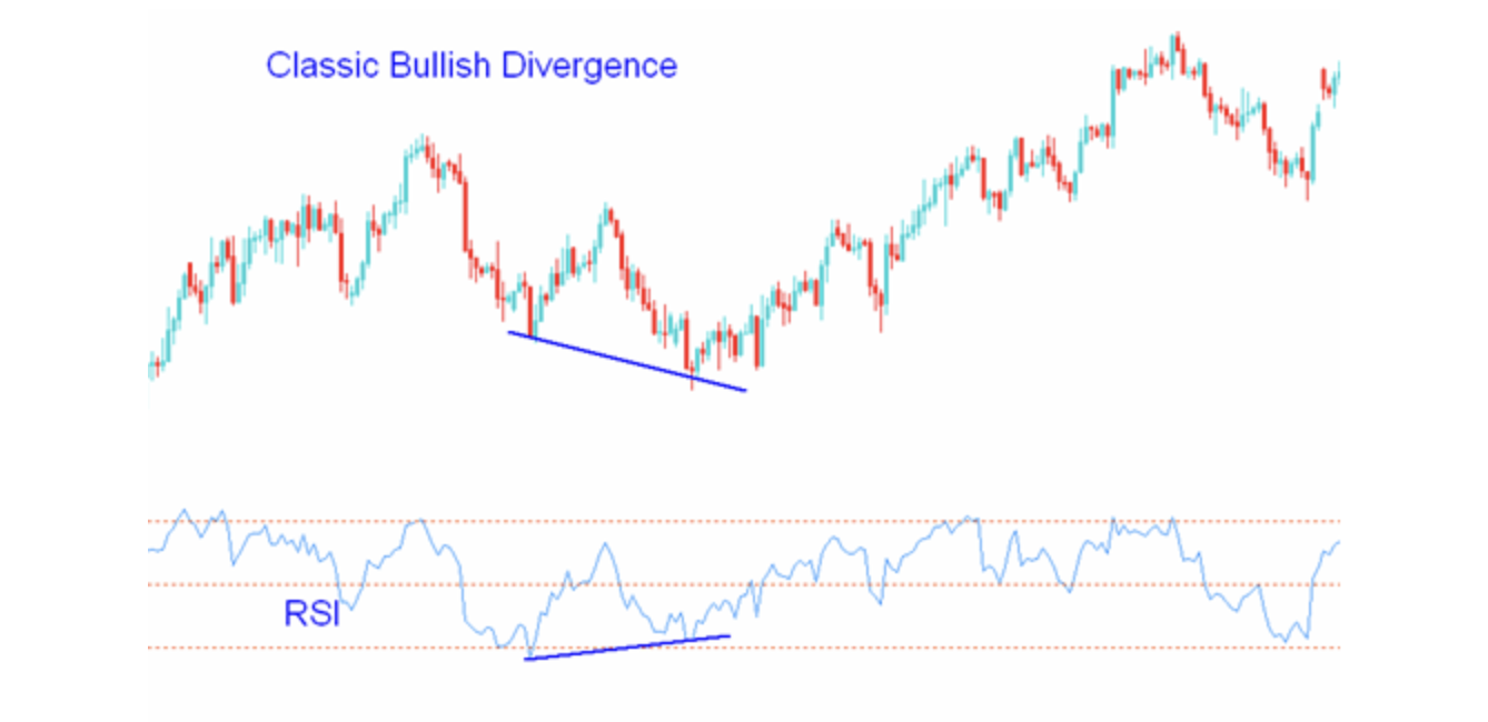
Currently there are no high time bullish divergences present for BTC.
BTC Log Chart Cycling to the Low of the Range
On the high time frame chart, bitcoin reverts to the exponential moving average. Therefore, I find it useful to define a bounded range for BTC using the log chart.
A logarithmic price scale is plotted so that the prices in the scale are not positioned equidistantly, but instead, the measure is plotted in such a way that two equal percent changes are plotted as the same vertical distance on the scale. Logarithmic price scales are better than linear price scales at showing less severe price increases or decreases.
When price cycles to the low of the range, it usually signals an optimal time to begin building a long term spot position. We are currently sitting near the range low on the BTC HTF log chart.

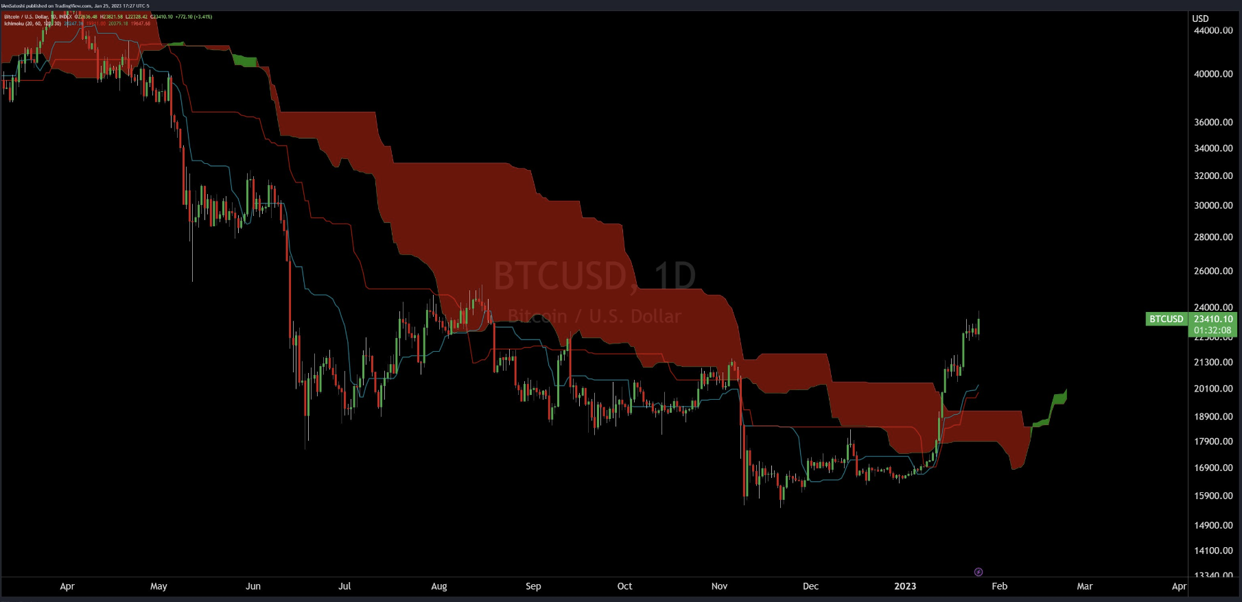
Price Trading Above the HTF Ichimoku Cloud
The Ichimoku Cloud is a type of chart used in technical analysis to display support and resistance, momentum, and trend in one view. The TenkanSen and KijunSen are similar to moving averages and analyzed in relationship to one another.
When the shorter term indicator, TenkanSen, rises above the longer term indicator, KijunSen, the securities trend is typically positive. When TenkanSen falls below KijunSen, the securities trend is typically negative. TenkanSen and KijunSen as a group are then analyzed in relationship to the Cloud, which is composed of the area between Senkou A and Senkou B.
In order to feel comfortable spot positioning, I want to see price trade back above the Ichimoku Cloud, which will signal a shift in momentum to the upside. Currently, price is trading above the cloud on the daily chart, (shown below), but below the cloud on the weekly chart.
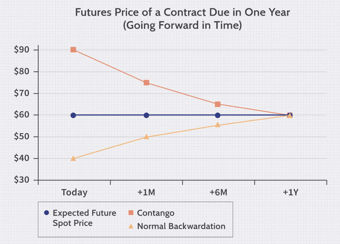
Backwardation After a Horrific Down Candle
A final signal I watch is for a captiulation event to take place. One way this has happened in the past is a horrific down candle followed by backwardation. Backwardation is when the current spot price is higher than prices trading in the futures market. This is a strong signal that spot demand is higher than speculative demand, i.e. stronger hands who hold for longer are buying rather than short term speculators. The combination of a capitulation candle and backwardation provides an excellent signal that the bottom might be in. So far, we have not seen this combination yet this cycle.