Bottom Formation 1.1 - Macro
Disclaimer: This is not financial advice. Anything stated in this article is for informational purposes only, and should not be relied upon as a basis for investment decisions. Chris Keshian may maintain positions in any of the assets or projects discussed on this website.
To subscribe to my mailing list, input your email here.
To determine when to begin spot positioning in crypto assets, I look for bottom formation by watching signals from four key areas: Macro, Capital Inflows, Sentiment, and Technical Analysis. I arrived at these areas by regressing the change in price against a number of independent variables - a process I outlined in an earlier post titled Models . While each of these taken in isolation can be misleading, the confluence of all four help me identify an approximate high time frame accumulation range, and therefore, an appropriate time to begin spot positioning between market cycles.
The other posts in this series are:
Bottom Formation 1.0 - Intro
Bottom Formation 1.1 - Macro
Bottom Formation 1.2 - Capital Inflows
Bottom Formation 1.3 - Sentiment Analysis
Bottom Formation 1.4 - Technical Analysis
While I do think we are currently in the midst of a bear market rally, I believe we are in the early stages of this bottoming process. As such, I plan to track these signals more closely over the coming six months, and add to my spot positions as more of my conditions are met.
In this post, I will outline the Macro signals I am tracking, reproduced below:
Interest Rates
Correlation to the M2 money supply
Correlation to Risk Assets (e.g. QQQ, NQX)
DXY Weakness
Correlation to Inverted 10-year Real Rates
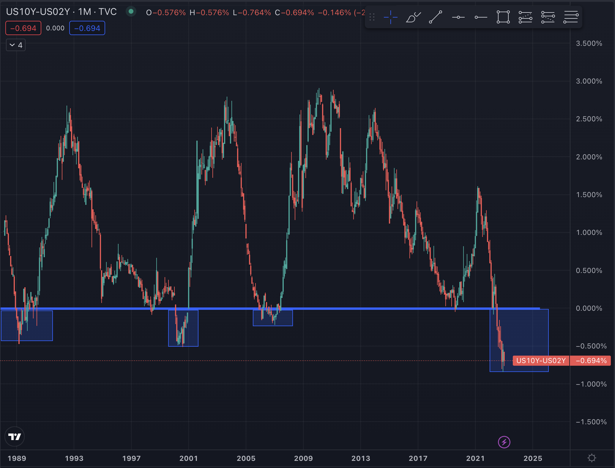
Bottoming Process of the US10Y-US2Y
Interest Rates
The first signal is obvious. Interest rates are the denominator of the discounted cash flow formula. When rates increase slightly, the present value of future cash flows decreases - often drastically.

Since most of the value of tech stocks are in the future, tech stocks get hit hardest as rates increase. Crypto, broadly, is a tech asset class, and often comprises the riskiest portion of an investor’s tech portfolio. As such, interest rates have an outsized effect on this asset class. To feel comfortable allocating more to spot positions, investors want to see rates stabilize and begin to fall.
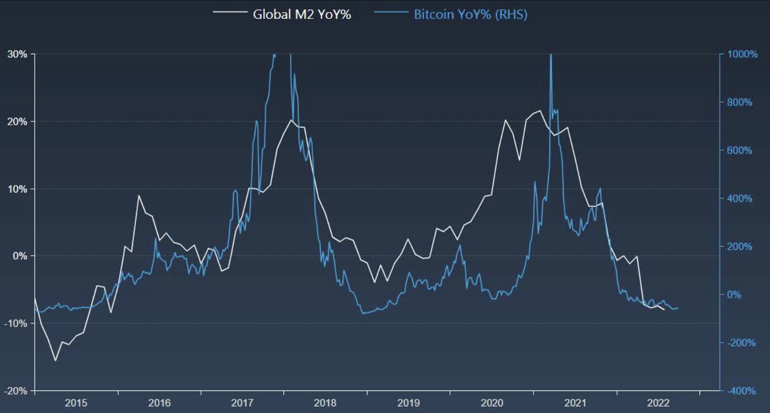
M2 Correlation
The M2 Money Supply is the measure of the money supply that can be easily converted to cash. Since 2015, Bitcoin has been highly correlated to M2. As shown in the chart below, an expansion in the global money supply has preceded a rise in the Bitcoin price. This makes sense, since crypto is subject to liquidity conditions. I am watching for an expansion in the global money supply, as one signal for more favorable conditions for risk assets.
Bottoming in Risk Assets
Since 2020, crypto has also been highly correlated to risk assets. As shown in the chart below, bitcoin has become increasingly correlated to the Nasdaq since 2020.

An even more fine-grained correlation can be found in the QQQ, which I use as my metric for tracking general risk appetite amongst investors. Once QQQ has begun to form a bottoming pattern, I will feel more comfortable allocating to crypto.
DXY Weakness
Crypto, and risk assets more broadly, are inversely correlated to the strength of the dollar, since USD is the denominator for these asset trading pairs. DXY has been strong throughout 2022, but looks like it might have topped. To feel comfortable buying risk assets, investors want to see a clear top on DXY, and a downtrending DXY index chart.

10-yr Real Rates
The next metric I track is the inverse correlation between Bitcoin and 10-year real rates. The chart below shows the the inverse of 10 year real rates charted against bitcoin. As you can see, price changes in the 10-year real rates has preceded bitcoin price moves since 2019. This makes sense, as rates impact investor appetite for risk, as discussed above.

US10Y-US2Y Chart
The next macro chart I am tracking is the US10Y-US2Y real rates. I expect bottom formation on this chart to signal peak recession. Risk assets likely bottom before this, but this indicator will serve as additional confluence to add to my spot positions. As shown in the below chart, historically this US10Y-US2Y real rate bottoming process has signaled the peak of past recessions (highlighted in blue).